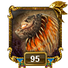
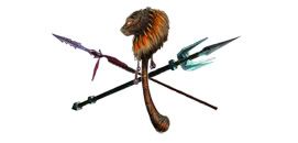
Zaviax submitted a more realistic take on the three-weapon logo I came up with, and I put it in place last night to see how it looks.
Comments?
So... new logo?
Moderator: Shaman Mods
71 posts
• Page 1 of 2 • 1, 2
So... new logo?
![]() by Samanna » Fri Jan 06, 2006 2:13 pm
by Samanna » Fri Jan 06, 2006 2:13 pm
-
Samanna
-

- Posts: 6516
- Joined: Fri Jun 17, 2005 10:49 am
- Server: Prexus

Shaman Main

![]() by Tidykat » Fri Jan 06, 2006 2:18 pm
by Tidykat » Fri Jan 06, 2006 2:18 pm
Forgive me.. but where's it at? I would assume it's in your post but eh... it's not showing up in Firefox..
[edit]
Doesn't showin this post in IE for me either.. that's strange..
[edit]
Doesn't showin this post in IE for me either.. that's strange..
Last edited by Tidykat on Fri Jan 06, 2006 2:19 pm, edited 1 time in total.
-- 70.858
-- 75.599
Cazic Thule Server
-- 75.599
Cazic Thule Server
-

Tidykat - Posts: 91
- Joined: Wed Jul 27, 2005 4:47 am
- Server: Cazic-Thule
![]() by Zaviax » Fri Jan 06, 2006 2:26 pm
by Zaviax » Fri Jan 06, 2006 2:26 pm
Perhaps you guys are in the subsilver theme? May have to switch to ezSerenity to see it.
Unfortunately when I was working on it I had subsilver in mind where the logo and the area for it is bigger, so for the serenity skin I had to shrink it quite a bit.
Unfortunately when I was working on it I had subsilver in mind where the logo and the area for it is bigger, so for the serenity skin I had to shrink it quite a bit.
-

Zaviax -

- Posts: 310
- Joined: Wed Jul 27, 2005 11:53 am
- Server: Tunare
![]() by Samanna » Fri Jan 06, 2006 2:39 pm
by Samanna » Fri Jan 06, 2006 2:39 pm
Odd. Image is at ... oops, overwrote it, sorry.
Prior version was http://crucible.samanna.net/templates/e ... wlight.jpg

Prior version was http://crucible.samanna.net/templates/e ... wlight.jpg
Last edited by Samanna on Sat Jan 07, 2006 2:28 am, edited 2 times in total.
-
Samanna
-
- Posts: 6516
- Joined: Fri Jun 17, 2005 10:49 am
- Server: Prexus
Shaman Main


![]() by Grendalkhan » Fri Jan 06, 2006 3:35 pm
by Grendalkhan » Fri Jan 06, 2006 3:35 pm
<a href="http://www.magelo.com/eq_view_profile.html?num=586374">Teesa Zjoquor</a>
<a href="http://www.magelo.com/eq_view_profile.html?num=453758">GrendalKhan Rose</a> (Retired)
"The general shaman consensus, however, is that the lead spell designer is so wedded to his self-delusional notions of godhood, that he refuses to admit any error unless someone up the food chain from him stuffs a change down his throat."-Chutoi Dogslobber
- Grendalkhan
-
- Posts: 312
- Joined: Thu Aug 04, 2005 4:47 pm
-
WaringMcMarrin -

- Posts: 1871
- Joined: Sun Jul 31, 2005 3:24 am
- Server: The Tribunal(Ayonae Ro)
Shaman Main
Monk - Alt/Box
Wizard - Alt/Box

![]() by Samanna » Fri Jan 06, 2006 6:24 pm
by Samanna » Fri Jan 06, 2006 6:24 pm
.png should work, as that is a placed image, not a cell background.
http://samanna.net/2pix/god.png is a .png

http://samanna.net/2pix/god.png is a .png
-
Samanna
-
- Posts: 6516
- Joined: Fri Jun 17, 2005 10:49 am
- Server: Prexus
Shaman Main
![]() by taraddar » Fri Jan 06, 2006 8:45 pm
by taraddar » Fri Jan 06, 2006 8:45 pm
Unfortunately because IE doesn't support them well png files are pretty much worthless. The only way they will reliably work is as a png -8 which is basically just a gif file with a different extension. That also means transparency is a really bad idea. indexed transparency looks horrible unless you can set your matte color which you couldn't do with the type of background you have and different themes for the boards.
Lvl 70 Barb shaman
of
on Cazic Thule
- taraddar
- Posts: 90
- Joined: Wed Jul 27, 2005 11:48 am
![]() by Mead » Fri Jan 06, 2006 9:07 pm
by Mead » Fri Jan 06, 2006 9:07 pm
I like the weapon graphics, but overall I like the old one better. Perhaps if the purple was turned down or the graphic was otherwise colored to match the rest of the site color scheme it would be better.
- Mead
- Posts: 77
- Joined: Tue Nov 08, 2005 9:13 pm
- Server: The Nameless
![]() by ThraallFV » Fri Jan 06, 2006 11:48 pm
by ThraallFV » Fri Jan 06, 2006 11:48 pm
so i was reading this thread and had no clue if i had the new one or not.... so i went to and hit the refresh button instead of just clicking links like i normaly do and i got a brand new logo.
I like the artwork but i agree the purple oval is very overpowering
I like the artwork but i agree the purple oval is very overpowering
Thraall
Firiona Vie
Firiona Vie
-
ThraallFV
-

- Posts: 511
- Joined: Thu Aug 18, 2005 2:56 am
- Server: Firiona Vie
Shaman Main
![]() by Zaviax » Sat Jan 07, 2006 2:09 am
by Zaviax » Sat Jan 07, 2006 2:09 am
Thanks all a lot for the feedback. 
Anyway, I think many here agree. Purple = bad. In fact personaly I don't like the oval at all. I thought it'd work but after toying quickly with no background at all I think we could do without it.
Anyway, here's an idea with the site name added in on the side. (Doesn't neccesarly have to be the font I chosen)

I'm not too fond of the fire effect on the TA though. I'd likely have to find something else to use. The ring on the 1.0 is very faint with that background though. Still it's kinda nice and settle.
I also did another one without the name and increased the size of the logo. This one I kept the fire out of the TA though.

Also, just wanted to add in the orginal logo in it's size I worked with with the black background to show ya's what I mean by it really does need a black background to get the best effect. However I'm just not sure if there's a way to work it in and make it look like it fits.

(oops, accidentally mirror image that one, in case you're wondering why the weapons are on opposite sides )
)
Anyway, I think many here agree. Purple = bad. In fact personaly I don't like the oval at all. I thought it'd work but after toying quickly with no background at all I think we could do without it.
Anyway, here's an idea with the site name added in on the side. (Doesn't neccesarly have to be the font I chosen)
I'm not too fond of the fire effect on the TA though. I'd likely have to find something else to use. The ring on the 1.0 is very faint with that background though. Still it's kinda nice and settle.
I also did another one without the name and increased the size of the logo. This one I kept the fire out of the TA though.
Also, just wanted to add in the orginal logo in it's size I worked with with the black background to show ya's what I mean by it really does need a black background to get the best effect. However I'm just not sure if there's a way to work it in and make it look like it fits.
(oops, accidentally mirror image that one, in case you're wondering why the weapons are on opposite sides
-
Zaviax -
- Posts: 310
- Joined: Wed Jul 27, 2005 11:53 am
- Server: Tunare


71 posts
• Page 1 of 2 • 1, 2
Who is online
Users browsing this forum: No registered users and 14 guests